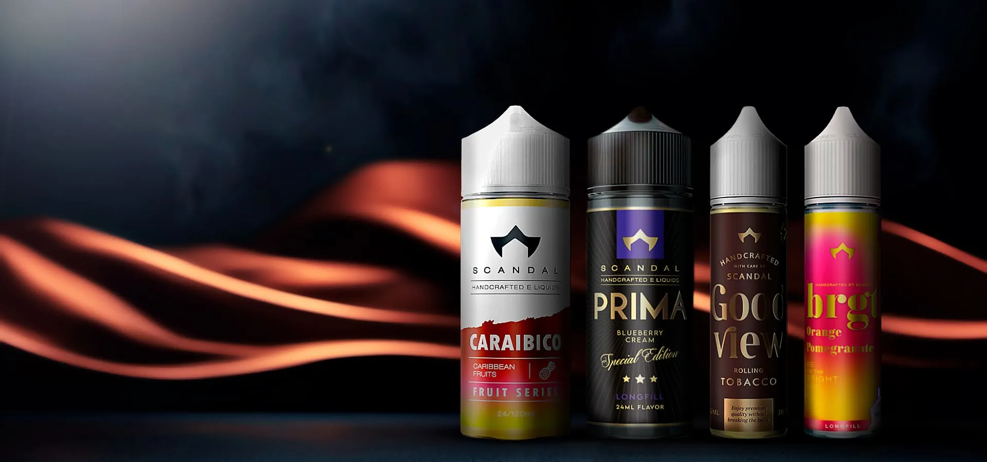
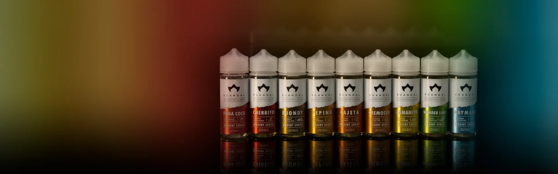
A consistent identity across every touchpoint.

Scandal Flavors

Scandal Flavors: the home page

Scandal Flavors: the home page

Scandal Flavors: the home page on a phone

Scandal Flavors: the home page on a phone

The client

Scandal Flavors has made e-liquids in Athens since 2017. Its website is in English and asks visitors to confirm their age before it shows the catalogue.

Client
Scandal Flavors
Sector
Brand & e-commerce
Based in
Kallithea, Athens
Founded
2017
Languages
English
Platform
WordPress, WooCommerce

The brief

Digital identity and online store design for Scandal Flavors.

The challenge

A manufacturer’s online presence needs to connect company identity with its catalogue and different trade relationships.

The approach

The design work creates consistency between the identity and catalogue presentation. Company information and partnership journeys share one visual language.

The home page, top to bottom

The same page on a computer and on a phone.

Scandal Flavors: the whole home page

Scandal Flavors: the whole home page
  1. Scandal Flavors: Age check on a phone

    Scandal Flavors: Age check on a phone
    01

    Age check

    The entry asks visitors to state that they are over 18. The screen is shown here as it appears, unanswered.

  2. Scandal Flavors: The series on a phone

    Scandal Flavors: The series on a phone
    02

    The series

    Each product series is a large tile with a photograph, its name and a link.

  3. Scandal Flavors: A colour for each series on a phone

    Scandal Flavors: A colour for each series on a phone
    03

    A colour for each series

    The tiles change ground from dark to pastel to bright colours, depending on the series.

  4. Scandal Flavors: Instagram on a phone

    Scandal Flavors: Instagram on a phone
    04

    Instagram

    Six images from the company’s Instagram account.

  5. Scandal Flavors: Newsletter and footer on a phone

    Scandal Flavors: Newsletter and footer on a phone
    05

    Newsletter and footer

    A sign-up field for the newsletter and a dark footer with the logo and the customer service links.

01Catalogue

One product per card, on white.

The “Flavors” page shows the products in a grid of three columns. Each card has the photograph of the pack, the name and a short description. Sorting sits above the grid and the “Load more items” button at its end.

  • Six ways to sort
  • A breadcrumb above the catalogue
  • On a phone the cards sit one under the other

Scandal Flavors: Catalogue

Scandal Flavors: Catalogue

Scandal Flavors: Catalogue on a phone

Scandal Flavors: Catalogue on a phone

02The company

The story, the lab, the product.

The “About” page has four sections: “Our story”, “The Company”, “The Lab” and “The Product”. Each has its text, and most have a black and white photograph.

  • The base in Athens and the starting year, 2017
  • Three icons for delivery, instalments and refunds
  • Newsletter sign-up before the footer

Scandal Flavors: The company

Scandal Flavors: The company

Scandal Flavors: The company on a phone

Scandal Flavors: The company on a phone

03FAQ

Five answers that open at a touch.

The “FAQ’s” page is one column of five questions. The first is open when the page loads and the others open at a touch.

  • A breadcrumb above the title
  • A symbol shows which question is open
  • A link to the page from the footer

Scandal Flavors: FAQ

Scandal Flavors: FAQ

Scandal Flavors: FAQ on a phone

Scandal Flavors: FAQ on a phone

On a phone

Same character. A different rhythm.

The collection composition becomes a vertical sequence, keeping each image and name together. The entry screen is documented as a distinct state within that experience.

Scandal Flavors: screen 1 on a phone

Scandal Flavors: screen 1 on a phone

Scandal Flavors: screen 2 on a phone

Scandal Flavors: screen 2 on a phone

Scandal Flavors: screen 3 on a phone

Scandal Flavors: screen 3 on a phone

Scandal Flavors: screen 4 on a phone

Scandal Flavors: screen 4 on a phone

Colours

Packaging organises the catalogue.

Scandal Flavors’ visual presence is built around its different packaging collections. Neutral navigation lets the products’ colours and graphics stand out. This study focuses on identity consistency, catalogue organisation and interface presentation.

What we delivered

  1. 01Visual identity and digital design
  2. 02Catalogue organisation
  3. 03Online store development

Screens from the public website, October 2026. Live-site content may change.

Visit the website
Let’s make something yours.Tell us your idea