

MyShelter
The feeling of a place, from the first screen.
Visit the websiteA digital presence for MyShelter in Palaio Faliro, connecting the atmosphere of the space with the discovery of massage and Pilates services.
The challenge
A wellness space needs to convey its character before a visit. At the same time, visitors need to distinguish between services and find a clear route to booking.
The approach
Large photographic surfaces, warm colours and a measured visual pace connect with organised service pages. The narrative establishes the first impression; navigation provides the next step.
Room to take a breath.
Photography of the space opens the experience and sets its tone. Warm neutrals, soft gold and dark brown connect the digital presence with MyShelter’s materials and light. Large typographic compositions and open surfaces give each image room of its own.
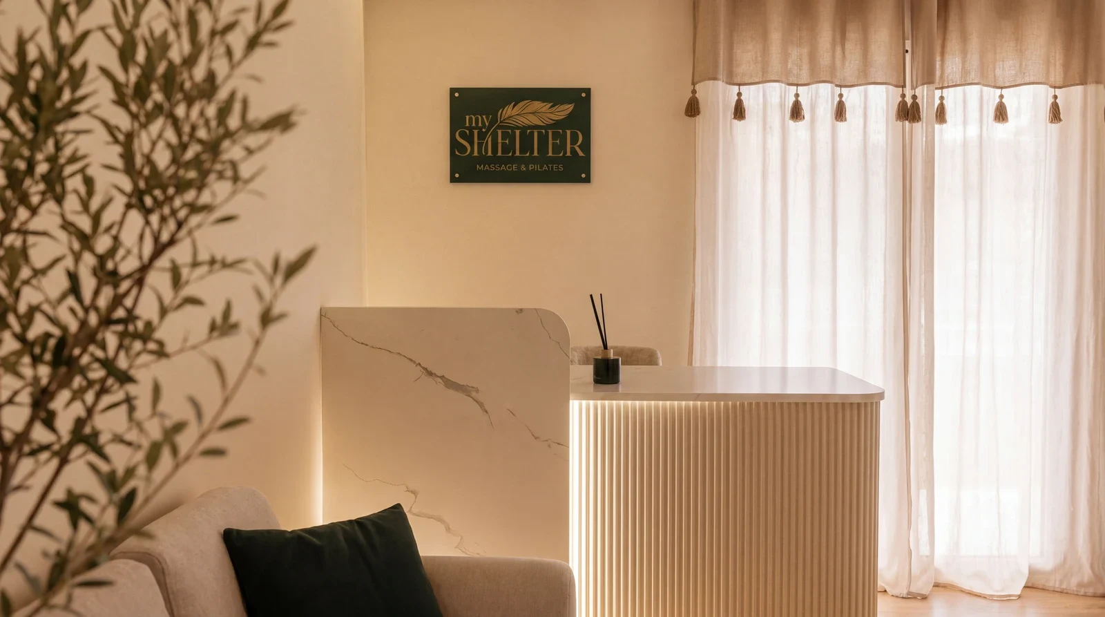
The space before the information.
The homepage opens with a photograph that fills the screen. Visitors encounter the character of the space before moving into the details. Alternating large images with short sections creates distinct chapters in the browsing experience.
Warmth, carried through.
Cream surfaces give the content a clear background, while brown and gold connect headings, fine rules and primary actions. Rounded imagery and compact navigation recur from the homepage to the service pages, keeping the experience recognisable.
Discovery leads to a choice.
Services have their own imagery, short descriptions and detailed pages. The catalogue’s photographic opening gives way to practical information such as duration and price. Booking remains visible in navigation and beside the service details.
Every screen, a next step.
The homepage narrative and service catalogue move at different paces. One gives atmosphere space; the other brings choices together. Photographic cards, gentle contrasts and consistent navigation connect both journeys through the same design language.
A complete picture of the service.
On the Pilates Reformer page, explanation and practical selection sit side by side. The main text introduces the service, while a separate card brings together the instructor, duration, price and booking action. The hierarchy keeps both needs close without interrupting the reading flow.
Same character. A different rhythm.
The smaller screen retains large imagery and the warm palette while organising the story vertically. Headings wrap, navigation stays compact and each service gets its own space, allowing the image and essential information to be read together.
Select a screen for a closer look.The details make the whole.
- 01Original web design and photographic storytelling
- 02Service catalogue and detailed page structure
- 03Bilingual experience and booking journey
Screens from the public website · October 2026. Live-site content may change.
Another story.
Your idea doesn’t need to be finished. Just ready for a conversation.
Tell us your idea