

Green Pharmacy Lab
Every need has its own colour.
Visit the websiteAn online store for Green Pharmacy Lab in Patras, presenting beauty, health and pharmacy products in a colour-organised shopping experience.
The challenge
A pharmacy offers a wide range of products from many brands, with offers that change through the seasons. Visitors need to find the right product quickly, understand who it is for and know whether it is available.
The approach
We gave the categories a colour system that works as a map of the store. The catalogue, prices and stock are updated from the pharmacy’s ERP, and every product page organises the information that comes before a purchase.
A pharmacy with colour and order.
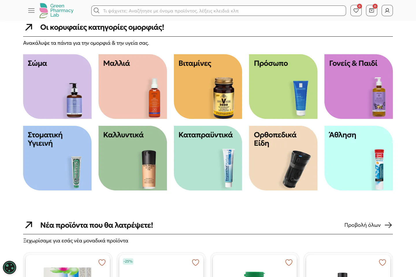
The logo’s green, teal and pink leaves set the tone. Green marks the key actions, such as adding to the basket, while soft pastels distinguish the categories. Clear, friendly typography connects headings, prices and buttons, and rounded surfaces bring warmth to a large catalogue.
Categories as a map.
On the homepage, the most popular needs appear first through photography: face, body, children and hair. Ten categories then each receive their own colour and a representative product. Visitors recognise the shelf they need before reading the catalogue.
Information before the basket.
Every product card shows the code, price, discount and availability beside the basket button. On the product page, the description is divided into sections such as who it is for, ingredients, how to use it and frequently asked questions.
Seasons change, the structure stays.
Offers, seasonal needs and trending products have consistent places on the homepage. The content is refreshed, while organic shapes, photography and colour surfaces keep the experience recognisable.
Every screen, a next step.
The journey starts with a need and ends with a specific product. Photographic categories and colour tiles give way to consistently structured cards, while the organic shapes around trending products and the blog add rhythm between catalogue sections.
From the shelf to the right choice.
On the category page, the sidebar groups brand and price-range filters, while sorting and the number of products per page sit above the results. Cards keep the same order of information for every product, so comparison stays quick.
Same character. A different rhythm.
On mobile, search stays visible beneath the logo. Categories are arranged in two columns, and on the product page availability, price and the basket action stay together before the detailed description.
Select a screen for a closer look.The details make the whole.
- 01E-commerce design and development
- 02Colour-coded categories and catalogue filters
- 03Catalogue and stock sync with the ERP
Screens from the public website · October 2026. Live-site content may change.
Another story.
Your idea doesn’t need to be finished. Just ready for a conversation.
Tell us your idea