01Porcelain
#FAF9F5--paperΧώρος για να αναπνέει το περιεχόμενο.
The living reference for every Omnica component, layout, state and interaction. The website and this page share the same code. A change to the language is incomplete until it is represented here.
Retain the Omnica mark. Every client design is unique, whether built with Framer, Webflow or custom code. Never buy, adapt or use website templates. Create the layout and art direction around the business; no generic dashboard decoration or stock award badges.
Lead with what a customer gets. Greek business owners are the primary audience. Write natural Greek first; explain technical terms. English supports international credibility and occasional clients. Explain decisions, deliverables and scope. Keep implementation details out of sales copy unless they affect a choice.
Microcopy must orient, explain an action or help someone complete a task. Omit decorative brand captions, repeated breadcrumb labels and filler slogans in the hero, menu, footer and calls to action. Keep service context, navigation and form feedback. Apply the same restraint in Greek and English.
Use the shared primitives, tokens and layouts documented here. Extend the system before using a new pattern. Update this page in the same change.
One expressive 3D stage; quieter interactions elsewhere. The decorative scroll arrow settles after two cycles. Motion must reveal hierarchy or respond to action. Content remains accessible without animation.
The palette comes directly from the original-logo 3D materials. Porcelain and ink lead; violet is the signature, periwinkle adds softness, lime supplies a small accent and chrome connects the surfaces. Client artwork retains its own colour identity.
Το χρώμα ξεκινά από τη μορφή μας. Violet και periwinkle, μια πινελιά lime, φως porcelain και βάθος ink.
#FAF9F5--paperΧώρος για να αναπνέει το περιεχόμενο.
#292834--inkΚαθαρός λόγος. Σταθερή παρουσία.
#4C38CF--violetΗ κύρια υπογραφή της Omnica.
#7F79E7--periwinkleΤο φως και η απαλότητα του violet.
#C4E43D--limeΜια μικρή, παιχνιδιάρικη έμφαση.
#E3E1EC--chromeΉρεμη βάση. Αντανακλάσεις στο 3D.
Πρώτα η πληροφορία. Μετά η έκπληξη. Οι αναλογίες είναι οδηγός για μια ολόκληρη σύνθεση, όχι ποσοστώσεις ανά οθόνη.
Τρεις εφαρμογές. Η ίδια υπογραφή. Καθαρό, συμπαγές χρώμα στα γράμματα. Απαλές χρωματικές μεταβάσεις στα φόντα και στα 3D υλικά.
Ink γράμματα σε porcelain φόντο. Καθαρή ανάγνωση, χωρίς εφέ.
Porcelain γράμματα σε ink φόντο. Η ίδια καθαρότητα, σε αντίστροφη παλέτα.
Απαλά, οργανικά πεδία. Χαμηλή ένταση και μεγάλη απόσταση από το κείμενο.
Χρησιμοποιούμε τις εγκεκριμένες αντιθέσεις για μικρό κείμενο. Το lime έχει πάντα σκούρα γράμματα. Το periwinkle μένει στα μεγάλα γράμματα, στα σχήματα και στο φως.
Ink / porcelain
13.77:1 · AAA
Porcelain / violet
7.19:1 · AAA
Ink / lime
10.03:1 · AAA
Η συνέπεια είναι μέρος της ποιότητας. Violet για ταυτότητα, lime για έμφαση, ουδέτερα για ανάγνωση. Δεν προσθέτουμε πορτοκαλί, ροζ ή rainbow gradients στη γλώσσα της Omnica. Οι εικόνες των πελατών διατηρούν τα δικά τους χρώματα.
#faf9f5Porcelain / main canvas
#292834Text / primary actions
#68666eSecondary text
#d9d7d6Dividers
#ffffffInverse text
#e6e4eeQuiet surfaces
#c8c3d9Supporting art
#4c38cfBrand signature / accent / accent-ink
#7f79e7Material / light / large display only
#e3e1ecNeutral material
#c4e43dFocused highlight
#292834Inverse surface / ink alias
#c1bdc8Text on night
#236045Confirmed state
#b22c36Failure state
#4c38cfKeyboard focus / violet alias
| Pair | Rule |
|---|---|
| Ink on paper / lavender / lime | Use for normal text and actions. |
| Muted on paper | Use for readable secondary copy, not disabled critical information. |
| Paper and night-muted on night | Default inverse palette. |
| Porcelain on violet / accent | 7.19:1. Use for the closing CTA. On lime hover, switch text to ink (10.03:1). Periwinkle is decorative or large text only with ink (4.00:1). |
| Error / success on their tinted surfaces | Always include an explicit message; colour alone is insufficient. |
Google Sans, self-hosted, weights 400–700, Greek/Greek Extended/Latin/Latin Extended subsets. Google Sans Flex is not used. Display copy stays mostly regular; utility labels use medium. Never fake uppercase Greek with CSS on body copy.
Made to matter.
Καθαρή σκέψη, δικός σας σχεδιασμός και τεχνολογία που δουλεύει. Clear thinking, original design and technology that works.
Η ποιότητα φαίνεται στις λεπτομέρειες και στον τρόπο που συνεργαζόμαστε. Όλα τα έργα ξεκινούν με μια συζήτηση.
| Role | Token / rule |
|---|---|
| Hero | --text-hero; 54–102px (5.65vw); desktop split 3:1, regular 400, −0.057em. Mobile uses 8.5vw within bounds; 36px below 380px. |
| Card titles | --text-xl, medium 500, line-height 1.2. |
| Utility / captions | --text-sm (14px) and --text-xs (12px). Eyebrows are 11px and provide useful section context; never repeat breadcrumbs or add decorative slogans. |
| Greek wrapping | Check accents, punctuation and long compound words at 360px. Do not truncate service names. |
| Hierarchy | One H1 per page. Section H2 and nested H3; visual size does not change semantic order. |
Spacing follows the token scale. Layout dimensions use documented fluid formulas; artwork coordinates are scene parameters, not UI tokens.
| Token | Value | Use |
|---|---|---|
| --space-1 … --space-4 | 4 / 8 / 12 / 16px | Fine rhythm, control internals, icon gaps |
| --space-5 … --space-8 | 24 / 32 / 48 / 64px | Component gaps, panels, section headings |
| --space-9 / --space-10 | 96 / 144px → 72 / 88px mobile | Section spacing |
| --gutter | clamp(20px, 4vw, 72px) | Page edge |
| --max-width | 1600px | Content canvas |
| --radius-sm / md / lg | 8 / 16 / 28px | Controls / cards / large surfaces |
| --radius-pill | 999px | Buttons, tags, choices |
| --shadow | 0 24px 80px / 10% ink | Screen mockups and modal only |
| Desktop / tablet / mobile | >1100 / 761–1100 / ≤760px | Explicit responsive layouts; header navigation collapses at 1000px; 380px narrow exception |
Original source: omnica.gr. Symbol and wordmark are separated from the original SVG, preserving path data. Keep generous clear space. Use Lucide outline icons at 1.5–2px stroke, generally 18–24px, with accessible names on icon-only controls.


Greek-first artwork for every public page: 110 individual 1200 × 630 JPEGs, including translated services, case studies and guides. Original logo, local Google Sans, the approved material colours and authentic project photography. Solid heading text. Regenerate with npm run social:generate.
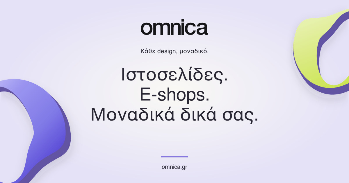
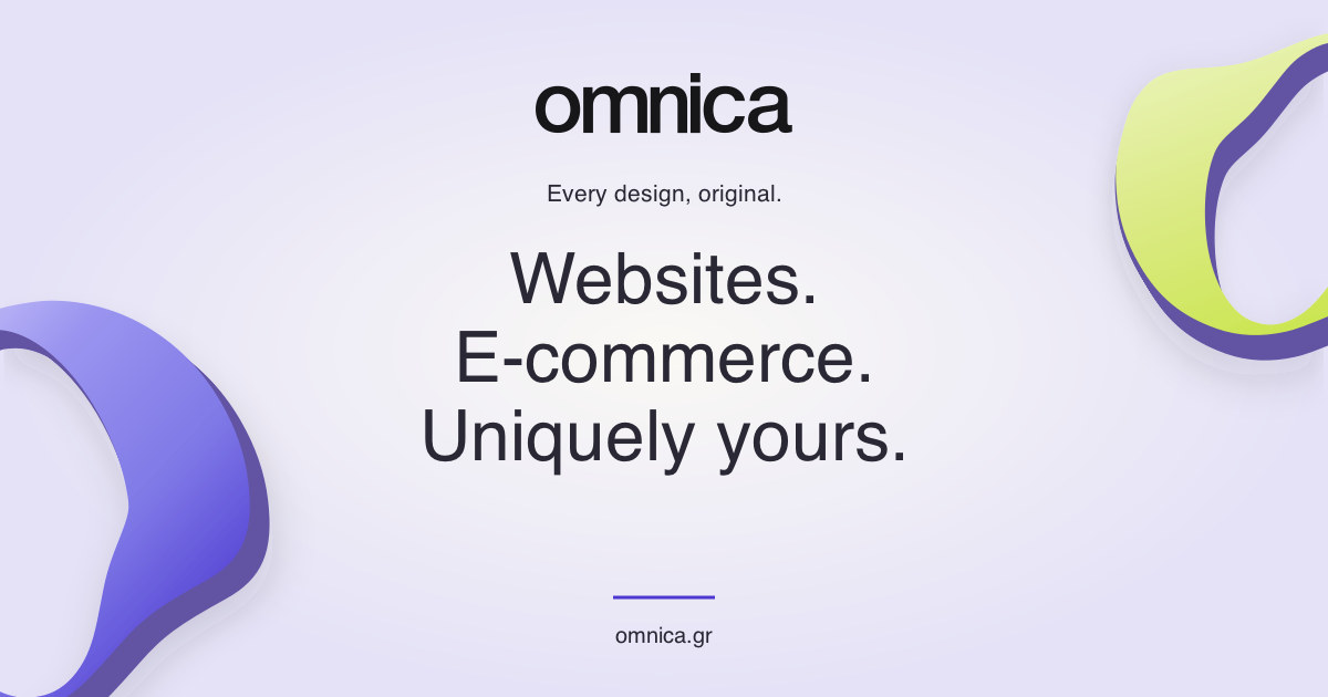
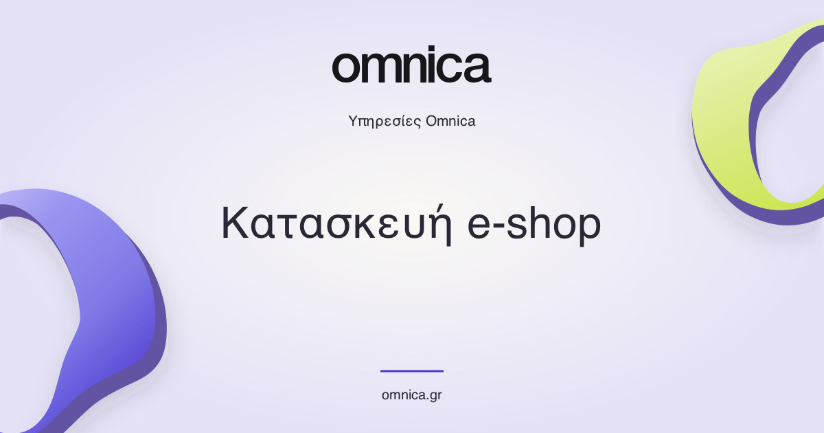
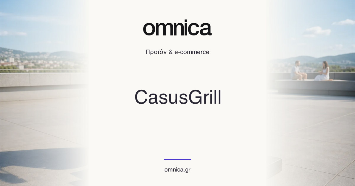
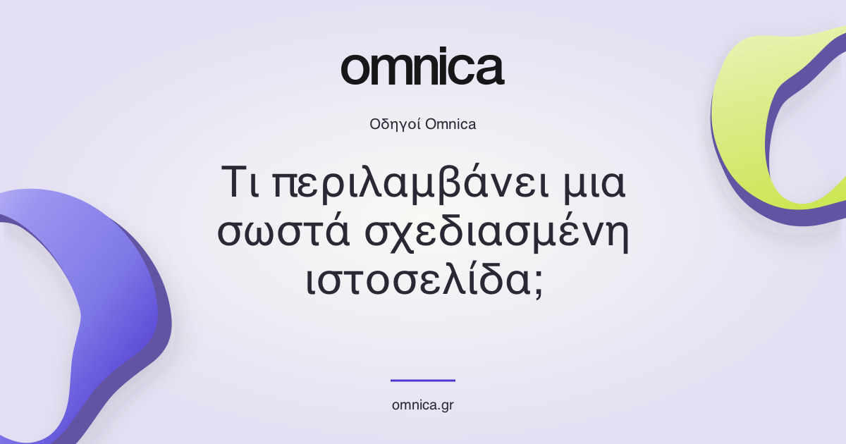
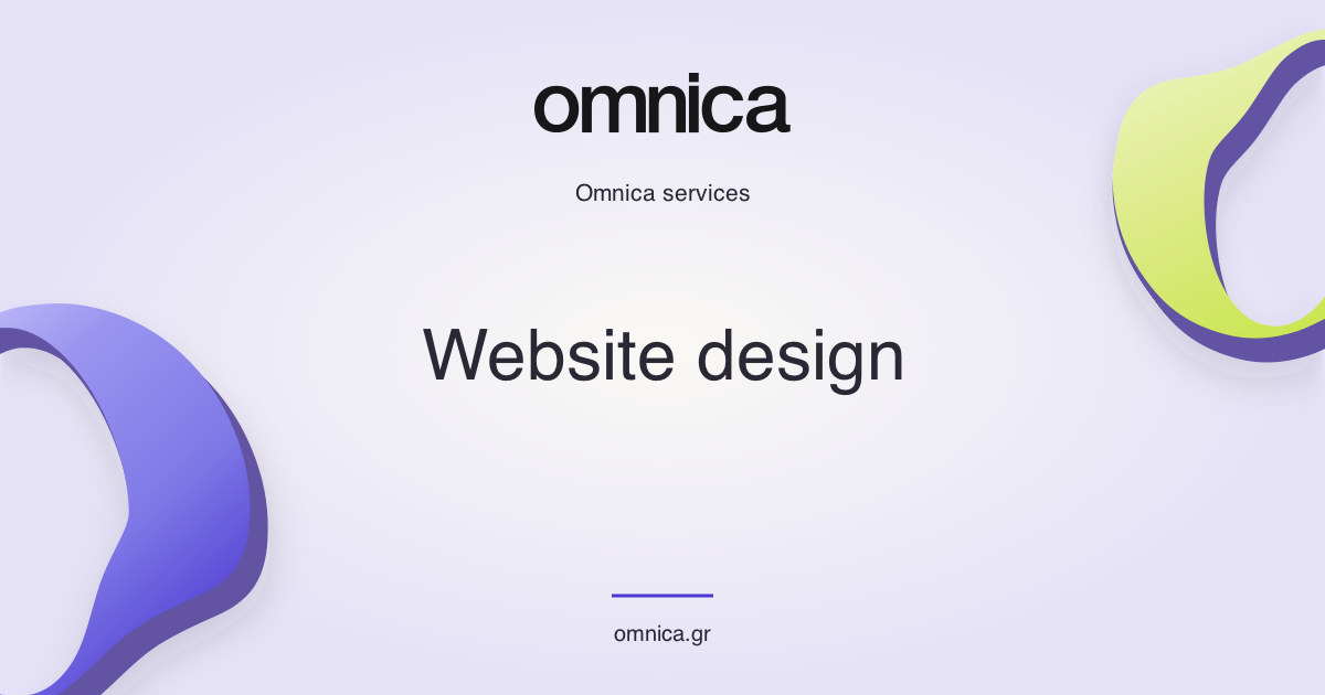
The central 590px holds the wordmark, title and domain. This square crop is a resilience check, not a replica or guarantee of any messaging app’s interface.
Images stay below 300 KB, in sRGB with no transparency. Each has a content-hashed URL, declared dimensions, MIME type and localized alternative text. Social crawlers receive the tags in server-rendered HTML without JavaScript.
Review deployments are noindex but crawlable. Sharing assets resolve to the public review host until launch. Canonicals and language alternates always identify omnica.gr; live production sharing uses omnica.gr once indexing is explicitly enabled.
Five restrained palettes share one generative language. Each section and service ID controls the light placement, ribbon geometry and material shading. The seed stays identical between Greek and English. Artwork is local, decorative SVG; no image service or continuous canvas is required. It never replaces real client imagery.
Quiet background / sculptural accent
Quiet background / sculptural accent
Quiet background / sculptural accent
Quiet background / sculptural accent
Quiet background / sculptural accent
| Pattern | Contract |
|---|---|
| OrganicField | Quiet or rich. Radial light blends fade at the section edges. Text keeps the paper/ink contrast. No decorative captions. 12px maximum fine-pointer parallax; static for touch and reduced motion. |
| ServiceArtwork | One stable ribbon seed per service, with a five-family palette. Depth-sorted SVG surface and soft shadow. Decorative, aria-hidden, no layout shift. A 1.35s arrival settles once; no endless drifting. |
| Placement | Page introductions, service catalogue groups, selected work and the closing CTA. Authentic project imagery remains the focal point of case studies. |
| Responsive | Service hero uses a 1.2:1 text/art split, then stacks below 760px. Gallery has three columns, then one. Fields are clipped internally, never the host focus ring. |
Headings use crisp, solid text. The owner removed the gradient and glow from highlighted words. Words inherit their parent heading’s colour and typography; the shared wrapper only keeps punctuation attached on narrow screens. This applies in Greek and English.
The previous black/white glow exploration is archived here for reference. It is not part of the active heading style or public page layouts.
| Pattern | Contract |
|---|---|
| API / variants | Public: LuminousWord(children, suffix) is an inline span; punctuation stays with its word to prevent orphaned periods on mobile; LuminousTitle(title, keyword) selects the first exact occurrence without changing the copy. Full-panel LuminousIntermission and its controls remain reference-only. |
| Typography / light | Inline words inherit Google Sans size, weight, tracking and line height. Never enlarge them independently or add padding. Text inherits the heading colour with no gradient, halo, blur or decorative duplicate layers. One complete word stays together when the heading wraps. |
| Colour | Solid ink on light surfaces, solid porcelain on dark surfaces. Keywords inherit the surrounding heading colour. Brand gradients are reserved for background artwork and materials. |
| Motion | No keyword animation. The text stays fully visible and sharp. The archived reference panels retain their original motion study, separate from active page typography. |
| Accessibility / controls | Plain semantic text, without decorative duplicates. Keep one H1 per page and its full natural accessible name. Forced colours preserve readable text. Keyword spans are not controls. Reference radio groups/replay remain native controls. |
| Use | Existing keyword wrappers on home, About, Services, Work, Insights, Contact and selected service H1s now only preserve wrapping; they add no visual emphasis. Preserve Greek/English parity. Avoid long unbreakable phrases, legal copy and client names. No standalone public panels. The interactive study remains noindex and outside the sitemap. |
Primary is ink; secondary is outlined; light belongs on a dark background. Buttons use a rising colour wash and an arrow handoff. Fine pointers add a restrained 4px magnetic response; focus gets the same colour and arrow feedback. Disabled and pending actions stay still. All controls have a visible keyboard focus ring and at least 44px interaction height. Hover effects are progressive enhancement, never the only indication of interactivity.
| State | Treatment |
|---|---|
| Default | Clear filled or outlined boundary; text and arrow. |
| Hover | Rising circular colour wash: primary ink to lime, secondary/light to ink. Two-arrow handoff, with up to 4px magnetic response for fine pointers. Focus receives the same colour and arrow treatment. |
| Focus-visible | 3px focus token outline, 5px offset. |
| Disabled | 40% opacity, no pointer action or hover translation. |
| Submitting | Disabled with explicit Sending label. Keep dimensions stable. |
| Navigation vs action | ButtonLink is a real link. Button is a native button. Do not render clickable divs. |
Actual shared project cards, service rows and editorial cards. Project imagery has recorded provenance. The card arrow appears on hover and keyboard focus, and is always visible on mobile.
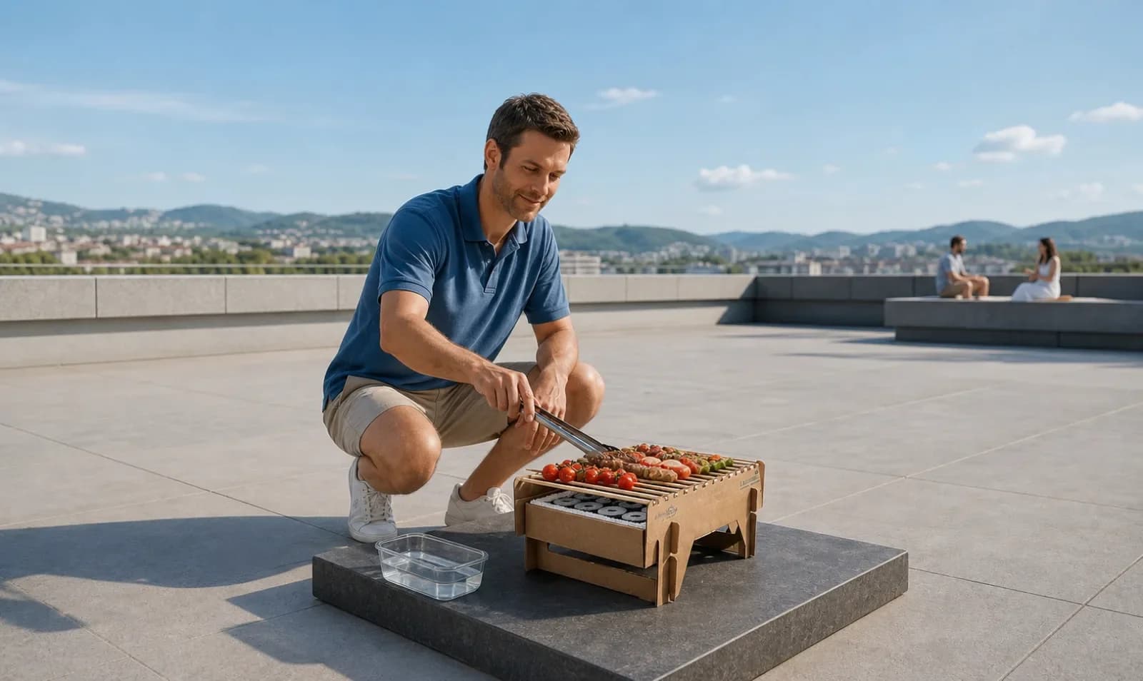 CasusGrill
A distinctive product. An experience that explains it.
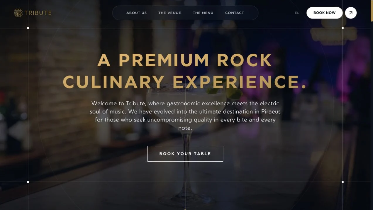 Tribute
Ο χαρακτήρας του χώρου, πριν την πρώτη επίσκεψη.
Η επιχείρησή σας, όπως της αξίζει.
A store that works. For you, too.
From structure and copy to maintenance: what to clarify before you start.
Read the guideBeing found in Google and AI answers, with practical priorities and realistic expectations.
Read the guideThe right choice starts with your catalogue and everyday operations.
Read the guideUse these shared patterns and the linked live pages. Reading width, hierarchy and source components are part of the contract.
A 1:2 editorial split. The eyebrow sits in the left column; the heading and supporting copy share the right. On mobile these become one column.
We discuss your business, people and goals. Together, we define what matters.
We organise content and journeys. You see the idea before it moves into development.
We bring form and function together. Details are tested on real devices.
We hand over, explain and agree on the next steps for the life of the project.
| Pattern | Desktop | Mobile |
|---|---|---|
| Homepage hero | 3:1 headline/support grid, then full-width stage | Full-width Greek supporting copy and CTA; stage 420px (370px very narrow) |
| Featured work | 2 columns; alternate card offset 96px | 1 column; no offset |
| Service catalogue | Sticky description 1:2 split | Description flows before rows |
| Service detail | Audience sidebar + reading column | Single column; sidebar not sticky |
| Deliverables | 2 columns with top dividers | 2 columns; 1 below 380px |
| Case study | Full-bleed art, 3 metadata columns, 2 story columns | Tall art, 2 metadata columns, stacked story |
| Editorial articles | 850px maximum including page gutter | Full available width with 20px minimum gutter |
| Contact | Aside + 2-column form | Aside, then full-width fields |
| Footer | 3 columns and large wordmark | Stacked navigation, contact and wordmark |
All motion must feel directed by an award-winning, world-class animator: intentional timing, continuity, controlled acceleration and an elegant settle. The logo playground extrudes the exact original Omnica SVG, including its inner opening. Thirteen substantial pieces in periwinkle, acid lime, porcelain, ink and chrome form a responsive composition; nine remain on narrow screens. Grab a piece and release it, brush past the pieces with the pointer, or use Shuffle. Momentum, solid contacts and damped springs return the field to its original composition. No invented ribbon, torus or substitute brand symbol. The only stage text is a useful interaction hint and named controls. All materials, lighting and contact shadows are local.
The same stage in its still state. Text and composition remain complete without a canvas or motion controls. This example forces the fallback without changing device preferences.
| Behaviour | Rule |
|---|---|
| Easing | --ease: cubic-bezier(.22,1,.36,1) |
| Durations | --fast 180ms / --normal 360ms / --slow 800ms. Choreography: button wash 650ms, arrow 580ms; CTA reveal 1.12s with 100ms stagger; service art 1.35s. |
| CTA | Two text lines arrive through a soft mask; the circular arrow settles from −30°. Hover moves the circle at most 18px, unfolds a ring and hands the arrow to its successor. It remains a normal link. |
| Page transitions | React ViewTransition with pathname identity: 240ms departure, 680ms arrival beginning at 60ms, restrained blur/vertical travel. Header stays anchored. Case images share a 720ms morph. Native cross-document dissolve supports locale changes. No click interception or navigation delay. |
| Fallbacks | Reduced motion removes translations and view transitions. Touch uses direct actions without magnetism. Browsers without view-transition support navigate normally. No essential information depends on animation. |
| Scroll reveals | GSAP, 28px translation, 950ms, once at 94% viewport. No initial opacity hiding. |
| Smooth wheel | Lenis duration 1.05; native anchors and keyboard remain usable. CSS scroll-behavior stays auto to avoid competing with route restoration. Disabled with reduced motion. |
| 3D interaction | Exact SVG extrusion with closed convex collision hulls. Rapier controls every visible pose: physical tilt, proximity repulsion, spring-driven grab and neighbour-to-neighbour momentum. Fixed 240Hz steps, continuous collision detection, 24 solver iterations, 120Hz contact stiffness and a 0.06-unit contact skin. A shared depth plane prevents passing behind pieces; the filled collision opening prevents nesting. No independent mesh lift, scale or teleport. Release restores each saved position. Native Shuffle button supports Enter/Space. Pause freezes the scene and disables Shuffle; resume settles remaining movement. |
| Rendering budget | DPR capped at 1.65; one shared geometry and six finishes. Lazy Three.js and local Rapier WASM initialization near the viewport; rendering sleeps when settled, off-screen or hidden. One restrained entrance, no endless idle spin. |
| Reduced motion / save-data | CSS composition masked with the same original SVG; no canvas initialization or controls. The still prop demonstrates it. Preference changes stop/dispose the scene immediately. |
| Failure / context loss | The original-logo SVG composition stays visible after fetch, WebGL or context failure. All geometry, materials, textures, renderer, observers and listeners are disposed. |
| Touch / mobile | Nine-piece composition, native vertical page scrolling retained via pan-y; horizontal drag and Shuffle offer direct play. No hover dependency. Controls remain at least 44px. |
| Brand usage | Homepage and About share the live HeroScene. The homepage belief panel uses still. Static and live marks derive from /brand/omnica-symbol.svg; no generated substitute logo. |
| Cleanup | All timers, listeners, tickers and contexts disposed on route change. |
Persistent labels and native input semantics. Service choice pills are real checkboxes. This exact enquiry form is in demo mode: it validates, previews success, and never sends email.
Missing-page recovery uses the same shared component below. Greek leads unmatched URLs; English route errors use English copy. Both home destinations remain explicit. The demo uses H2 so this reference retains one H1.
Η σελίδα που αναζητάτε δεν υπάρχει ή έχει μετακινηθεί. Ας επιστρέψουμε στην αρχή.
HTTP and delivery failures must never look successful. The actual API validates input, checks origin and size, applies a submission limit and separate idempotency keys. Success means the internal enquiry was accepted by Resend, not proof of inbox delivery. If only the acknowledgement fails, keep the enquiry successful, explain that confirmation is unavailable, and do not ask for a duplicate submission. Missing configuration returns an explicit unavailable response.
Greek-first consent, equal Accept / Reject buttons, optional analytics off by default. These interactive examples never store consent or send events.
| Pattern | Contract |
|---|---|
| Banner | Non-modal; 500px desktop card, 12px mobile inset. Shared secondary buttons give Accept and Reject identical weight. Preferences is a separate control; continuing to browse is not consent. |
| Preferences | Native dialog; focus contained, Escape closes without saving, focus returns to the opener. Analytics switch starts off. Always-on storage saves only the choice for 180 days. Footer settings reopens it. |
| States | Fresh/expired: banner. Accept: analytics enabled on production only. Reject/withdraw: collection disabled, GA cookies removed. Storage unavailable: visible status and analytics stays off. No artificial loading or success toast. |
| Motion | One 12px / 480ms settle for the banner, 380ms for the dialog; 240ms switch. No loops or attention pulses. Reduced motion removes the entrance and switch transition. |
| Tracking | G-DW5G3Z3TBK. Basic consent mode: no Google requests before acceptance. Manual page views and enquiry funnel. Form values, budgets, identifiers and raw URLs are excluded. Local/review/UI-system traffic never reaches GA. |
| Events | page_view; view_service; view_case_study; view_guide; contact_cta_click; language_switch; form_start; service_interest; form_submit_attempt; form_validation_error; form_submit_error; generate_lead; scroll_depth; faq_open; project_visit; email_fallback_click; playground_interaction. |
The form is the primary contact route. Header, footer and every CTA lead to it. Email is a collapsed fallback beneath the form, or a contact option for privacy requests. No email address competes with the enquiry form.
A Greek-first client acknowledgement and a private team summary, each with full English parity and a useful plain-text alternative. Internal routing is server-only; the client message has no CC or BCC.
600px table layout, 40px desktop gutters and 24px on mobile. Porcelain, violet, ink, chrome and a selective lime accent. Both team and client emails use the violet header and coloured original-symbol artwork; team notifications must not fall back to a monochrome design. Original logo artwork is embedded as CID PNGs; the message remains readable with images blocked. Email uses Arial / Helvetica for reliable Greek across inboxes; the website keeps local Google Sans.
Inline styles and Outlook width fallbacks carry the layout. No scripts, motion, tracking pixels, marketing subscription or promised response deadline. Essential information is real text. Keyboard-accessible links; narrow previews down to 320px.
The preview contains fictional data only. Use the full preview for both locales, team messages, mobile width and plain text.
39 patterns documented. Inspect the source before changing a component. If a new pattern is added to the site, add its live example, rules and registry entry here in the same change.
| Component / pattern | Source | Contract |
|---|---|---|
| CookieConsent / ConsentPanel / CookieSettingsButton | src/components/cookie-consent.tsx · src/lib/analytics.ts · src/lib/analytics-policy.ts | Consent banner, native preferences dialog, optional switch and persistent footer control. Equal Accept/Reject, Greek and English, keyboard/Escape/focus return, reduced motion. All variants at #privacy. Analytics is production-only, opt-in, no pre-consent pings, no personal form values. Storage failure leaves analytics disabled; withdrawal clears GA cookies. UI-system demos never persist or track. |
| BrandColourGuide / material palette | src/components/brand-colour-guide.tsx · src/lib/brand.ts · src/app/globals.css | The six original-logo finishes define the brand palette: porcelain, ink, violet, periwinkle, lime and chrome. Documentation shows swatches, proportions, gradients and measured contrast pairings. Solid heading text, organic art, CTA and WebGL share this palette. Gradients belong to backgrounds and materials, not heading words. No orange/pink/rainbow brand accents. Client artwork is exempt. Periwinkle is for decoration or large display text, never small text with ink. |
| Plain heading words / archived reference study | src/components/luminous-word.tsx · src/components/luminous-intermission.module.css · src/components/intermission-lab.tsx | LuminousWord / LuminousTitle retain their existing API names but render plain inherited heading text. No gradient, glow, blur, animation or duplicate decorative layers. The wrapper keeps suffix punctuation attached on mobile. Applies to both locales. Full intermission panels are an archived reference at /ui-system/intermissions, not an active public pattern. |
| OrganicField / visual palettes | src/components/organic-art.tsx · src/lib/visuals.ts | Five low-contrast palettes, deterministic service/section seeds, quiet/rich variants, decorative only. No captions. Fine-pointer parallax max 12px, reduced-motion/touch static. |
| ServiceArtwork | src/components/organic-art.tsx · src/lib/visuals.ts | Local projected ribbon SVG with stable per-service geometry and depth shading. Same seed in both locales. Soft once-only entrance, no endless loops; never substitute for authentic case imagery. |
| PageTransition / project morph | src/components/page-transition.tsx · src/components/ui.tsx · src/app/globals.css | Native React view transitions keyed by pathname. 240ms exit, 680ms arrival, fixed header; matching project images share a 720ms morph. No intercepted links or artificial waits. Cross-document locale dissolve and reduced-motion fallback. |
| Logo | src/components/ui.tsx | Use the original Omnica vectors. Symbol + wordmark by default; wordmark-only for the footer; inverse on dark surfaces. Never redraw or distort. |
| Button / ButtonLink | src/components/ui.tsx | Primary, secondary and light; md and sm. Links navigate, buttons act. Shared rising colour wash, two-arrow handoff and max 4px fine-pointer magnetism. Minimum 44px target. Disabled blocks action; pending retains the label and layout. |
| TextLink | src/components/ui.tsx | Underlined editorial link with a directional arrow. Use for secondary navigation, never a substitute for a form action. |
| Tag | src/components/ui.tsx | Default outline or active ink fill. A tag is descriptive. Wrap it in a link only when it navigates. |
| Eyebrow | src/components/ui.tsx | Small contextual label; optional two-digit section index. Use only when it adds useful orientation. No decorative slogans or repetition of adjacent headings/breadcrumbs. Never use as the only essential explanation. |
| SectionHead / PageIntro | src/components/ui.tsx · src/components/content-pages.tsx | SectionHead uses a 1:2 desktop grid and one mobile column. PageIntro has one H1, breadcrumbs and a lead, without a repeated section overline. Greek headings must wrap naturally. |
| Breadcrumbs | src/components/ui.tsx | Semantic breadcrumb navigation. Final item is the current page. Wrap on small screens; use the same path in BreadcrumbList JSON-LD. |
| Accordion | src/components/ui.tsx | Native details/summary; multiple items may be open. Enter and Space toggle. Plus rotates when open. Answers are present in server HTML. |
| ProjectCard / project artwork | src/components/ui.tsx | One link covers the card. Original project asset, category and clear story line. Alternate offset only in the featured desktop grid. Hover zoom 1.04 and an arrow; never hide access on touch. |
| ServiceRow / catalogue | src/components/ui.tsx · src/components/content-pages.tsx | Number, service title, short promise and arrow. Desktop catalogue has a sticky category description; mobile stacks. Hover shifts only 12px. |
| Header / navigation dialog / locale switch | src/components/header.tsx | Sticky translucent header. Native modal dialog traps focus and closes with Escape, close button or backdrop. Language switch stays on the equivalent page; desktop links collapse to menu on mobile. |
| HeroScene / logo playground / stage controls | src/components/hero-scene.tsx · src/components/logo-scene.ts · src/lib/logo-physics.ts | Exact original SVG extrusion, never a substitute loop. Rapier-driven tilt and proximity repulsion; spring drag, closed convex hulls, CCD and common depth prevent penetration or nesting. Contacts transfer momentum; release restores the exact saved arrangement. No mesh-only scaling, lifting or teleporting; keyboard Shuffle and Pause. Thirteen pieces / nine on mobile; no perpetual idle loop. Same SVG static fallback. Bounded DPR, off-screen/hidden-tab and settled suspension; semantic copy separate. |
| Homepage hero / brand strip | src/components/sections.tsx | Editorial headline and compact supporting copy above the sculptural stage. One clear service descriptor; no studio-status badge or slogan strip. Keep the work anchor. Client names reflect actual work; the brand strip wraps. |
| Service group / capability tags | src/components/sections.tsx | Dark surface groups capabilities into five understandable families. Heading links to a catalogue anchor; capability chips link to individual pages. |
| Belief / principle row | src/components/sections.tsx | Balanced art and editorial columns. Each numbered row has a concrete principle and explanation. One column on mobile. |
| Process | src/components/sections.tsx | Four steps; 4 columns large, 2 on tablets and phones, 1 below 380px. Keep statements concrete and avoid unexplained technical detail. |
| Discovery band | src/components/sections.tsx | Lime panel with one message and one primary action. Two columns desktop, stacked mobile. Reserve lime for focused highlights. |
| InsightCards | src/components/sections.tsx | Editorial three-column grid. Category, title, summary and reading link. One column on mobile. The title and CTA point to the same article. |
| ContactCTA | src/components/ui.tsx | Large two-line invitation with circular violet arrow with porcelain icon, switching to lime/ink on hover and useful supporting copy. No introductory slogan. One destination. Masked two-line arrival, staggered circle settle, max 18px magnetic response, expanding ring and arrow handoff. Reduced motion removes choreography. |
| Footer | src/components/footer.tsx | Lilac surface, navigation to the contact form and oversized original wordmark. No direct email shortcut. Bottom row contains copyright and UI-system reference only. No filler sign-off slogans, invented addresses or awards. |
| Service detail / deliverables / RelatedServices | src/components/content-pages.tsx | Audience sidebar and substantive service body; scoped deliverables and FAQs. Related links connect distinct capabilities. Never imply every deliverable fits every project budget. |
| Case study / metadata / screen frame | src/components/content-pages.tsx | Context, challenge, approach and visible delivery. Use authentic assets with source records. Do not invent metrics, dates or client statements. Screens have a neutral lilac frame. |
| Article / PrivacyPage | src/components/content-pages.tsx | Reading column max 850px including gutters. Proper heading order and descriptive sources. Do not claim a legal policy is complete without verified business information. |
| Field / input / select / textarea | src/components/contact-form.tsx | Persistent labels, visible required marker, associated hint/error IDs, native autocomplete and validity. Inputs use a bottom border; focus has a 3px outline. Errors add text, not only colour. |
| Choice group / consent / honeypot | src/components/contact-form.tsx | Real checkbox pills in a labelled fieldset. Space toggles. At least one service required. Privacy acknowledgement is separate from marketing; the hidden spam field is outside keyboard and accessibility navigation. |
| ContactForm / submission states | src/components/contact-form.tsx | Idle, submitting, accepted, accepted without client confirmation, and failed. Disable during submission, preserve input on errors and reuse submission IDs on retries. Internal acceptance permits success; acknowledgement failure must not invite duplicate submissions. Greek/English feedback examples at #states. Demo mode never calls the API. |
| Notice | src/components/ui.tsx | Info, success and error. Error uses alert; other feedback uses status. Provider acceptance of the internal enquiry is required for success; never imply confirmed inbox delivery. |
| Motion | src/components/motion.tsx | GSAP section reveal uses 28px translation without opacity hiding. CTA text has a bounded once-only masked arrival; base HTML remains visible without JavaScript. Lenis keeps keyboard/native anchors intact. Honour reduced motion and dispose on route change. GSAP matchMedia cleans up pointer, CTA and art choreography when preferences change. |
| 404 | src/components/not-found-view.tsx · src/app/global-not-found.tsx | Visible bilingual recovery with explicit Greek and English home links. Return a genuine 404 status for invalid paths. |
| Social preview artwork | scripts/social-images.ts · src/components/social-preview-gallery.tsx · src/lib/seo.tsx | 110 page-specific 1200×630 JPEGs under 300 KB. Central 590px crop-safe type and original wordmark, local Google Sans, palette-derived logo art or authentic project photos. Greek first with complete English parity. Content-hashed URLs, no JS/image optimizer dependency for crawlers; manifest coverage enforced before builds. Representative cards and a square crop are shown at #sharing. |
| Transactional email / email preview | src/lib/contact-emails.ts · src/components/email-preview.tsx | Original 600px table-based HTML, inline brand colours, original-logo CID PNGs, readable plaintext, Greek-first copy and complete English variants. Both team and client messages use the violet header and coloured logo-shape artwork, with both PNGs attached; never make the team variant monochrome. Email-only Arial/Helvetica fallback for inbox support. Client acknowledgements never expose internal headers or echo free-text input. Preview is sandboxed with fictional data, keyboard buttons, desktop/mobile widths and plain text. See #emails and /ui-system/emails. |
| FormEmailFallback / form-first contact | src/components/contact-form.tsx | Navigation and CTAs lead to the enquiry form in both locales. Direct email appears only inside a native details fallback beneath the form, or for privacy requests. Enter/Space toggles details; shared focus styles and readable narrow layout. The public fallback is hello@omnica.gr; private recipients exist only on the server. |
| UI-system documentation patterns | src/app/ui-system/page.tsx | Swatches, component demos, typography samples, state examples and scrollable rules tables are documentation-only patterns. They use the same tokens and primitives as the public site. |
| Area | Required verification |
|---|---|
| Visual craft | Review at 1440, 1280, 768, 390 and 360px. Check headline wrapping, gutters, optical alignment, image crops and the complete scroll narrative. |
| Awwwards ambition | Original concept, coherent visual execution and purposeful interaction. Use the award aspiration to raise craft, never as an invented credential. |
| Accessibility | Keyboard navigation, dialog focus and Escape, readable contrast, persistent labels, visible error text, reduced motion, touch controls. |
| Discoverability | Semantic server HTML, one H1, meaningful links, per-page metadata, canonical, reciprocal hreflang, sitemap and truthful structured data. |
| Performance | Aim for good field CWV: LCP ≤2.5s, INP ≤200ms, CLS ≤0.1. These are targets, not claims; measure on the deployed site with representative devices. |
| Localisation | All customer-facing journeys in Greek and English. Check actual Greek typography, not only Latin mock copy. |
| Functionality | Enquiry validation and error states, no duplicate submissions on retry, every internal link, 404s and same-page language switching. |
| Content | No fabricated proof. All 10 case studies and the full service mapping accounted for. Confirm legal business information before production. |
| Maintenance | Update this page, shared components and AGENTS.md rules together when the design language changes. |
Your idea doesn’t need to be finished. Just ready for a conversation.
Tell us your idea